
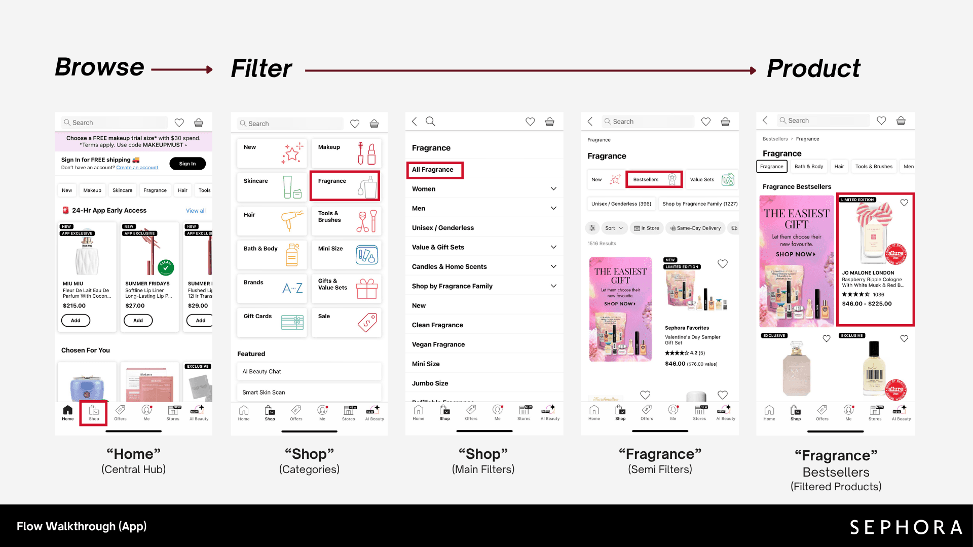
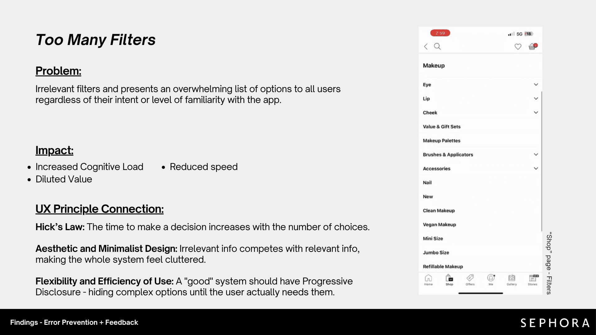


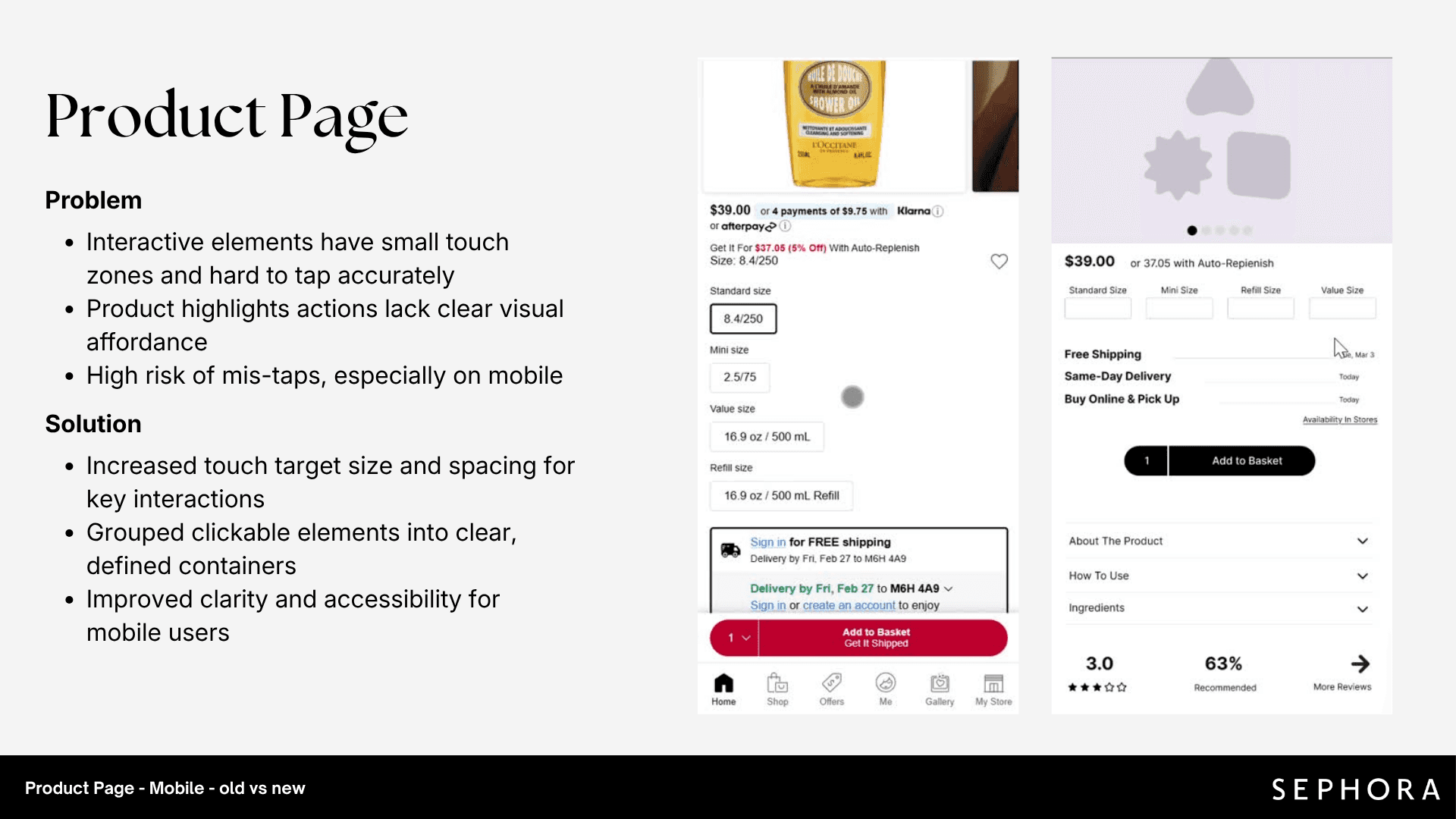




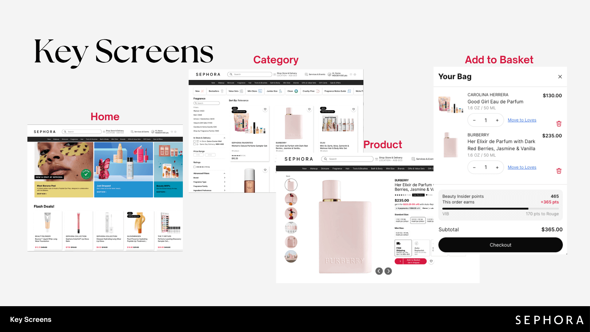


Sephora offers a huge catalog, but the interface lacks the visual hierarchy to manage it. Crowded pages, too many filters, inconsistent UI, and small touch targets make it hard to shop efficiently.
Redesign the core shopping flow (Browse → Filter → Product → Add to Basket) on mobile and desktop to reduce cognitive load, make filters easier to use, and make key actions clearer.
We audited the current mobile and desktop flow, mapping each issue to its impact and the UX principle behind it
Wireframes tested structure and hierarchy before visual design, focusing on the highest-impact issues from the audit.
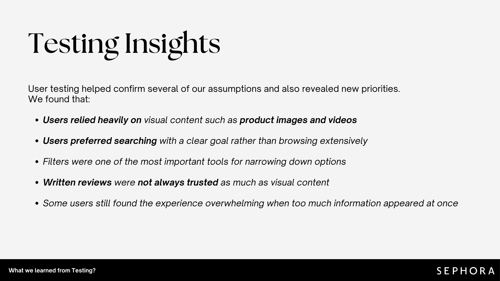
We ran moderated tests with returning and new users to see if the redesign made shopping faster and clearer.
A shared design system (typography, colors, spacing, buttons, and product cards) kept every screen consistent and fixed the inconsistent UI found in the audit.
The final design reflects what testing revealed, including reverting some early assumptions.
Explore the final clickable prototype in Figma.
